Design Gallery
-
![]()
Really Swell
ButtonThe client had a great product but was unsure of how to take it to market. We developed ten unique, eye-catching jar labels and three combo bags that can work together or alone.
-
![]()
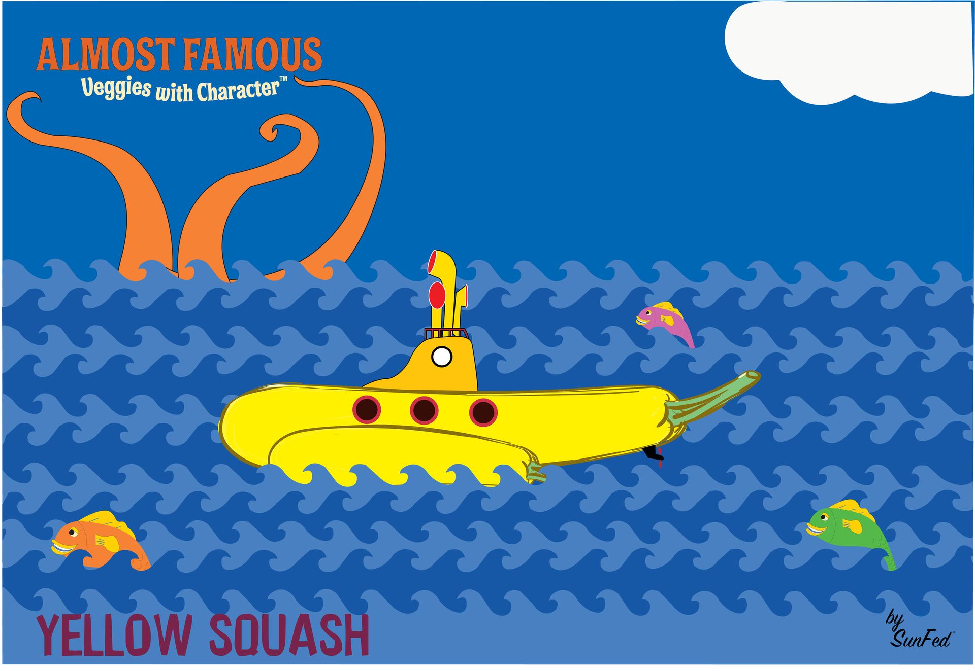
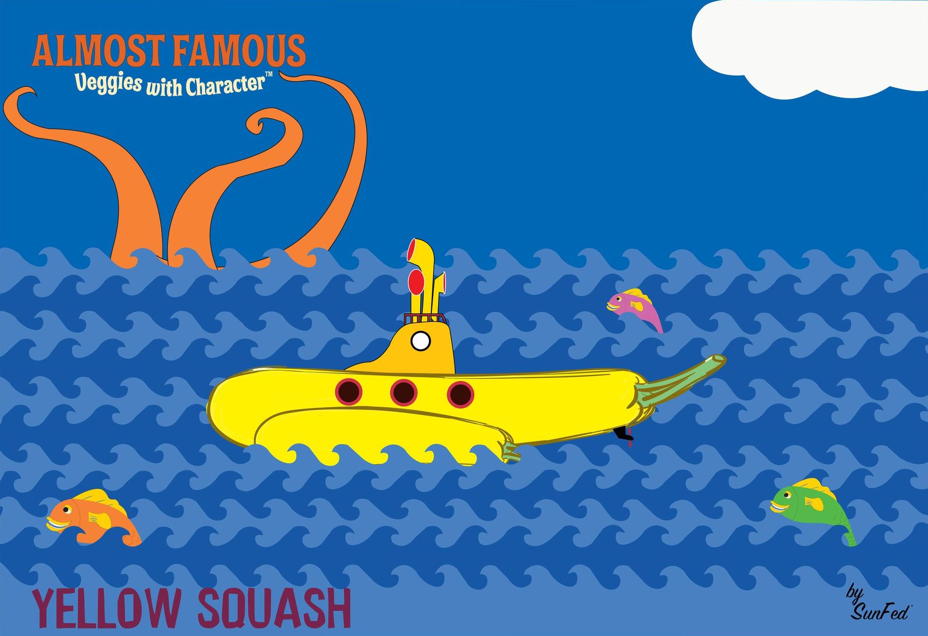
Almost Famous
ButtonSunFed's growers had perfectly good mishappen fruit left over after each pass in the field.
-
![]()
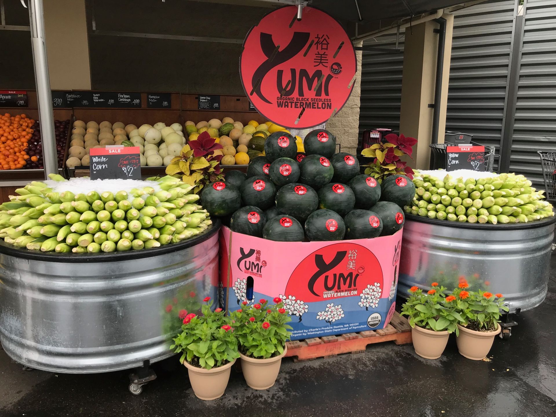
Yumi Watermelon
ButtonYumi, which means Beautiful in Japanese and Yummy in English, was the perfect name, and it was easy from there.
-
![]()
Better Life Organics
ButtonWhen our Client acquired Better Life Organics, it desperately needed a brand upgrade. We researched the field and presented what you see here.
-
![]()
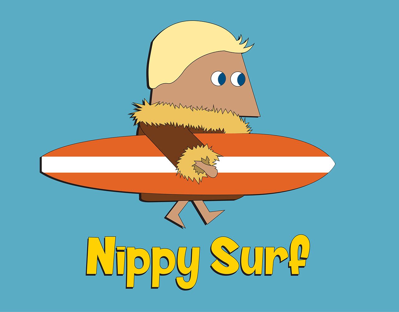
Nippy Surf
ButtonThis one's personal. Inhouse project to develop a cold water (because not everyone lives in Hawaii) surf brand.
-
![]()
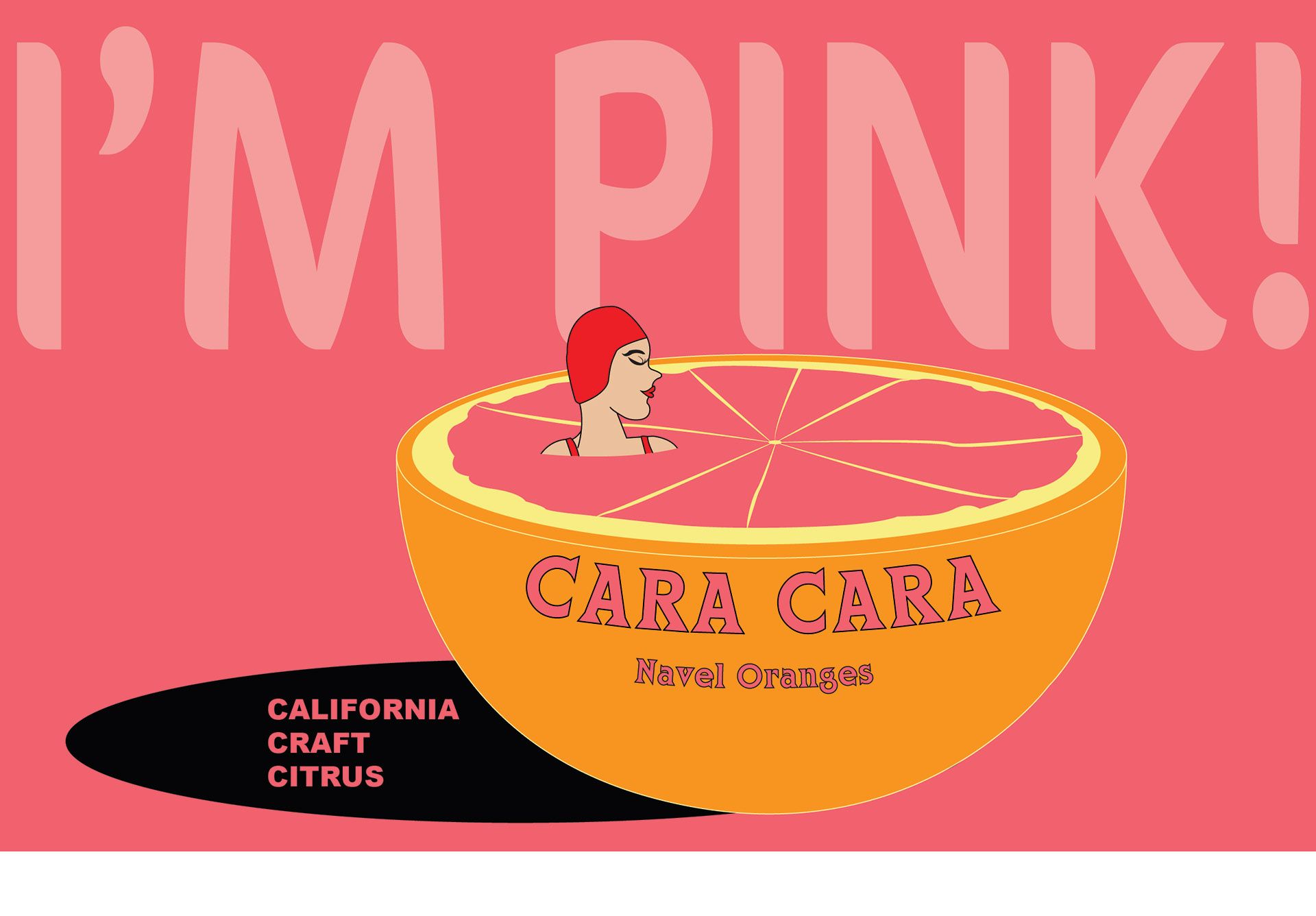
Cara Cara
ButtonThe challenge was distinguishing SunTreat's Cara Cara from other growers and calling it out to retailers and consumers.
-
![]()
Bueno Bueno
ButtonFor this project, the challenge was in rebranding an established product to attract new audiences...
-
![]()
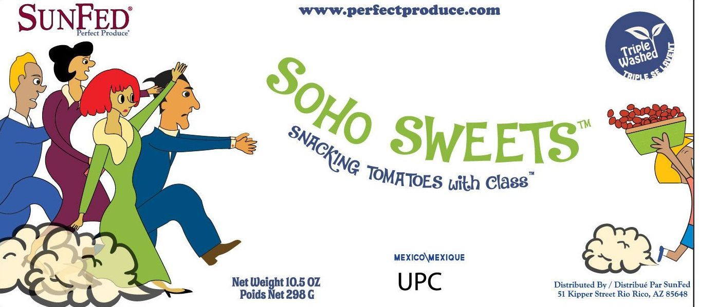
Soho Sweets
ButtonOur hand-drawn tomato label for SunFed. In a crowded market, we needed to stand out. SoHo Sweets are incredibly flavorful and, of course, sweet.
-
![]()
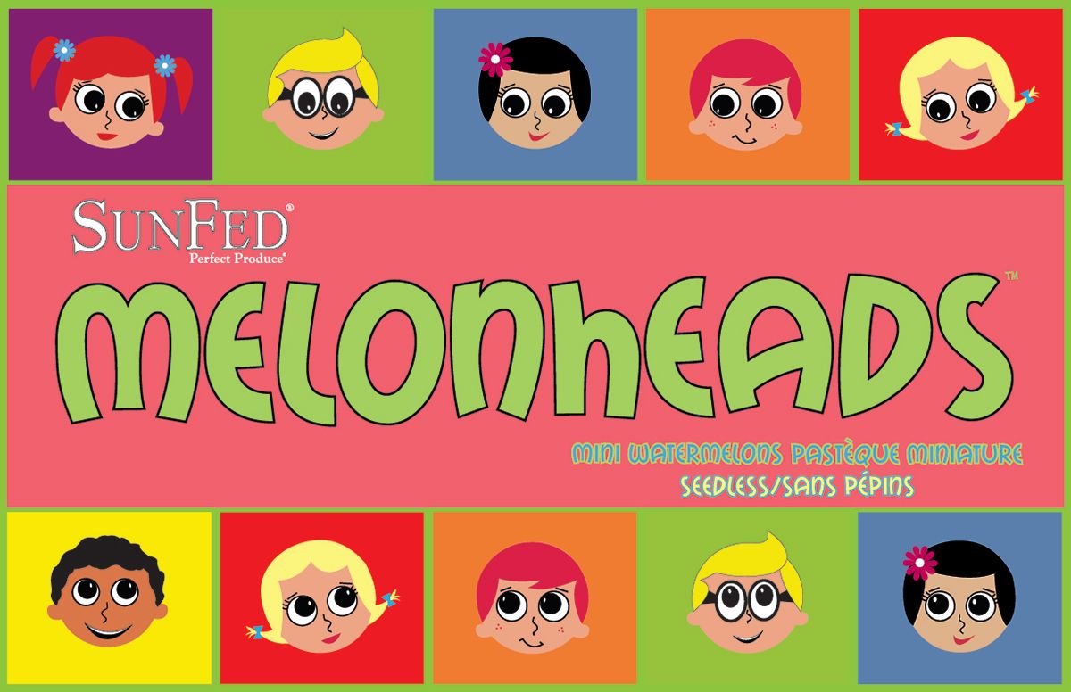
SunFed Melonhead
ButtonNew product for SunFed Produce. A two count of Mini Watermelons. Worked up these two characters in a hotel in Austin.
-
![]()
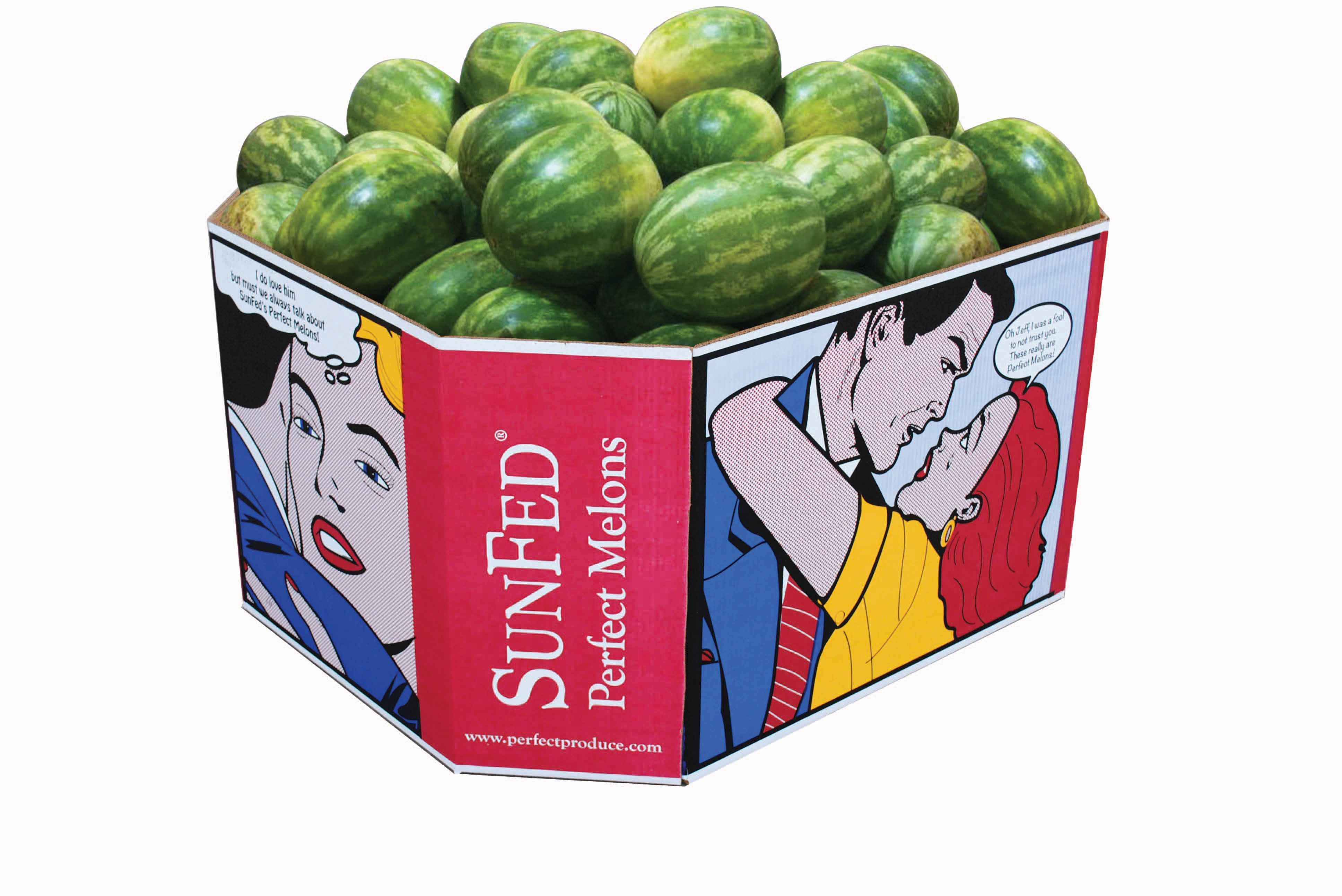
Perfect Produce
ButtonFor this project, the challenge was in rebranding an established product to attract new audiences...
-
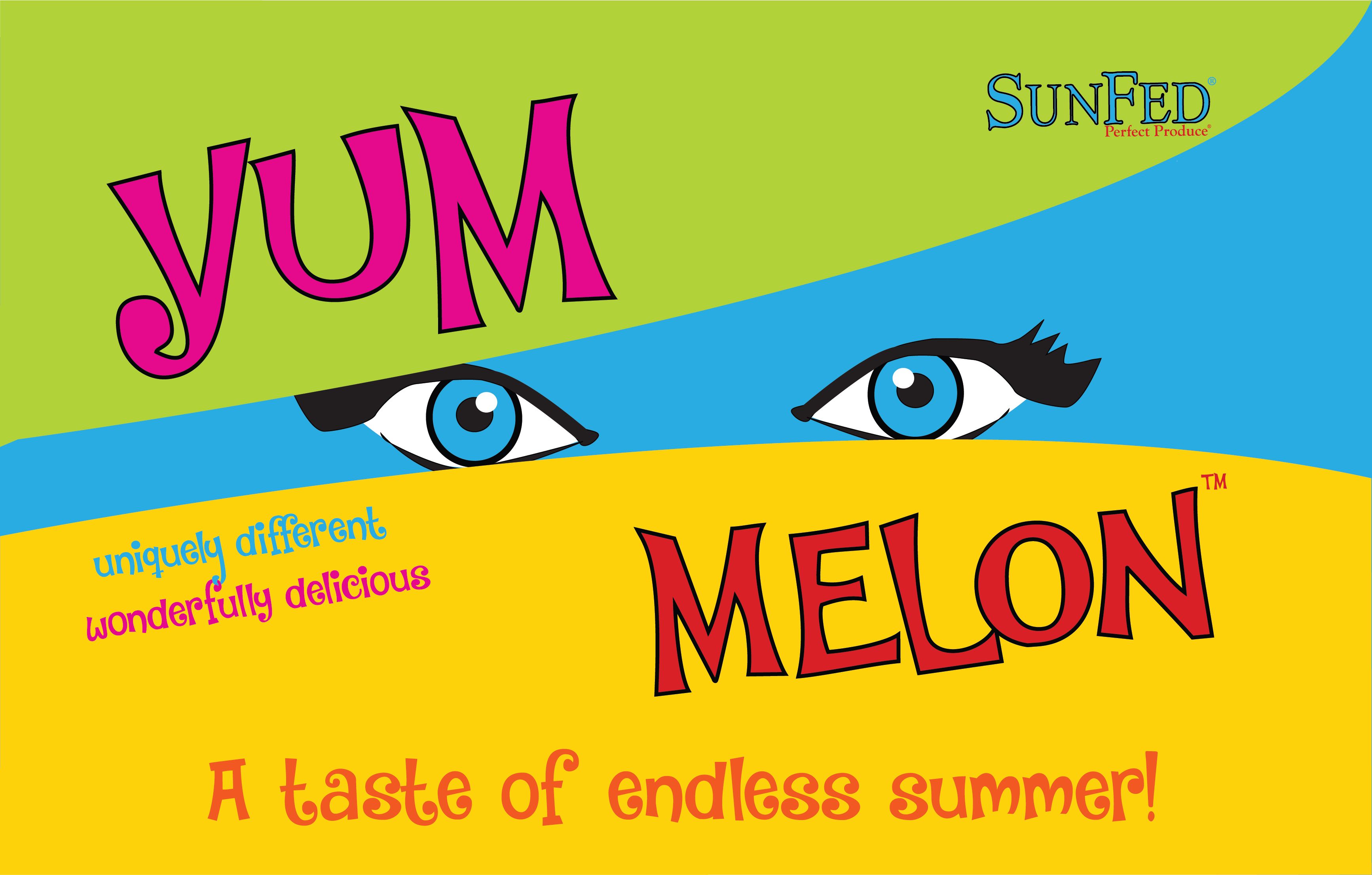
![]()
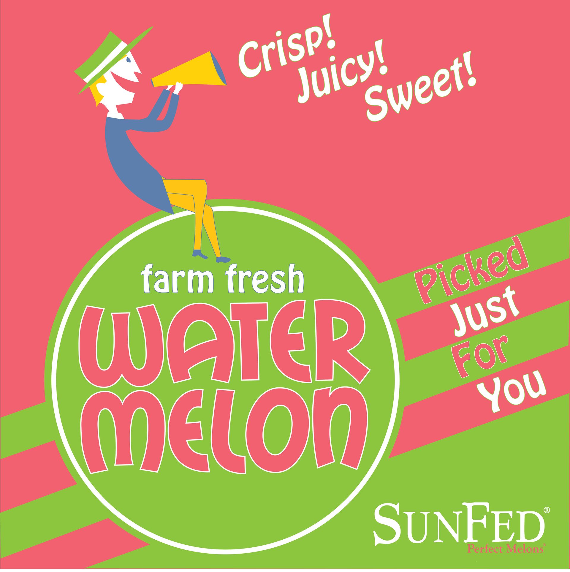
Yum Melon
ButtonA stand out melon needs a stand out label. Continuing in the tradition of giving our products bold...
-
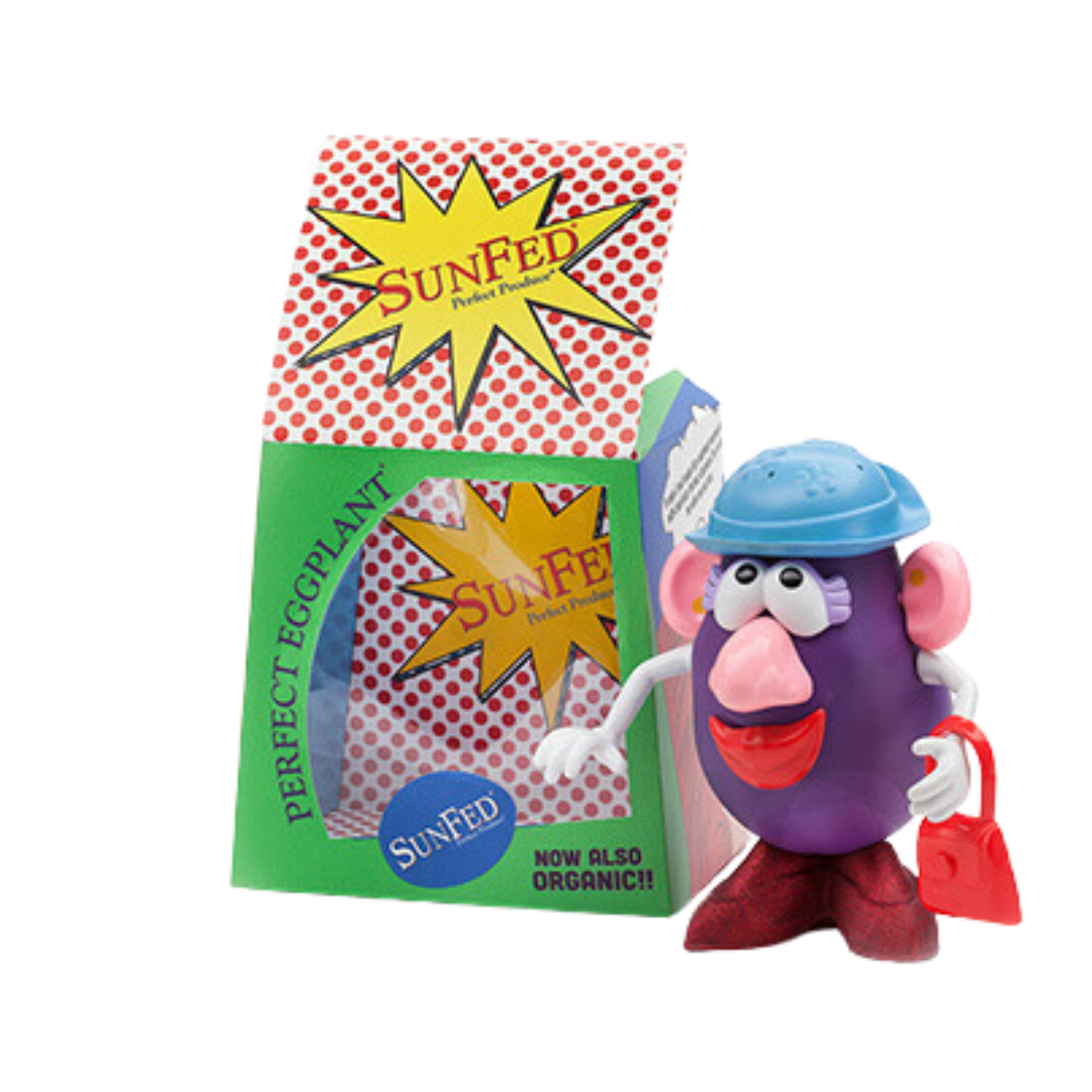
![]()
Mr & Ms Eggplant
ButtonWe needed a leave behind and or a introduction piece for our current and potential customers. I created these as a limited run of 30..
-
![]()
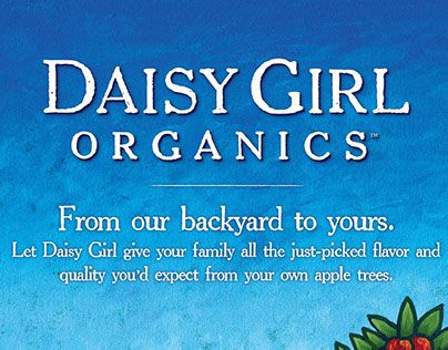
Daisy Girl Organics
ButtonOrganic Brands in Produce were all earth tone and rather bland. We wanted something big and bright for Daisy Girl, and we went with simple graphics and bold colors.
-
![]()
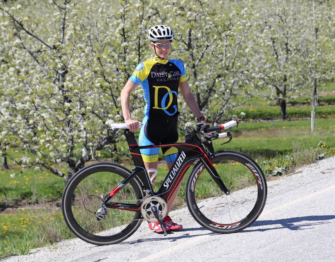
Cycling Gear
ButtonFor this project, the challenge was in rebranding an established product to attract new audiences.
-
![]()
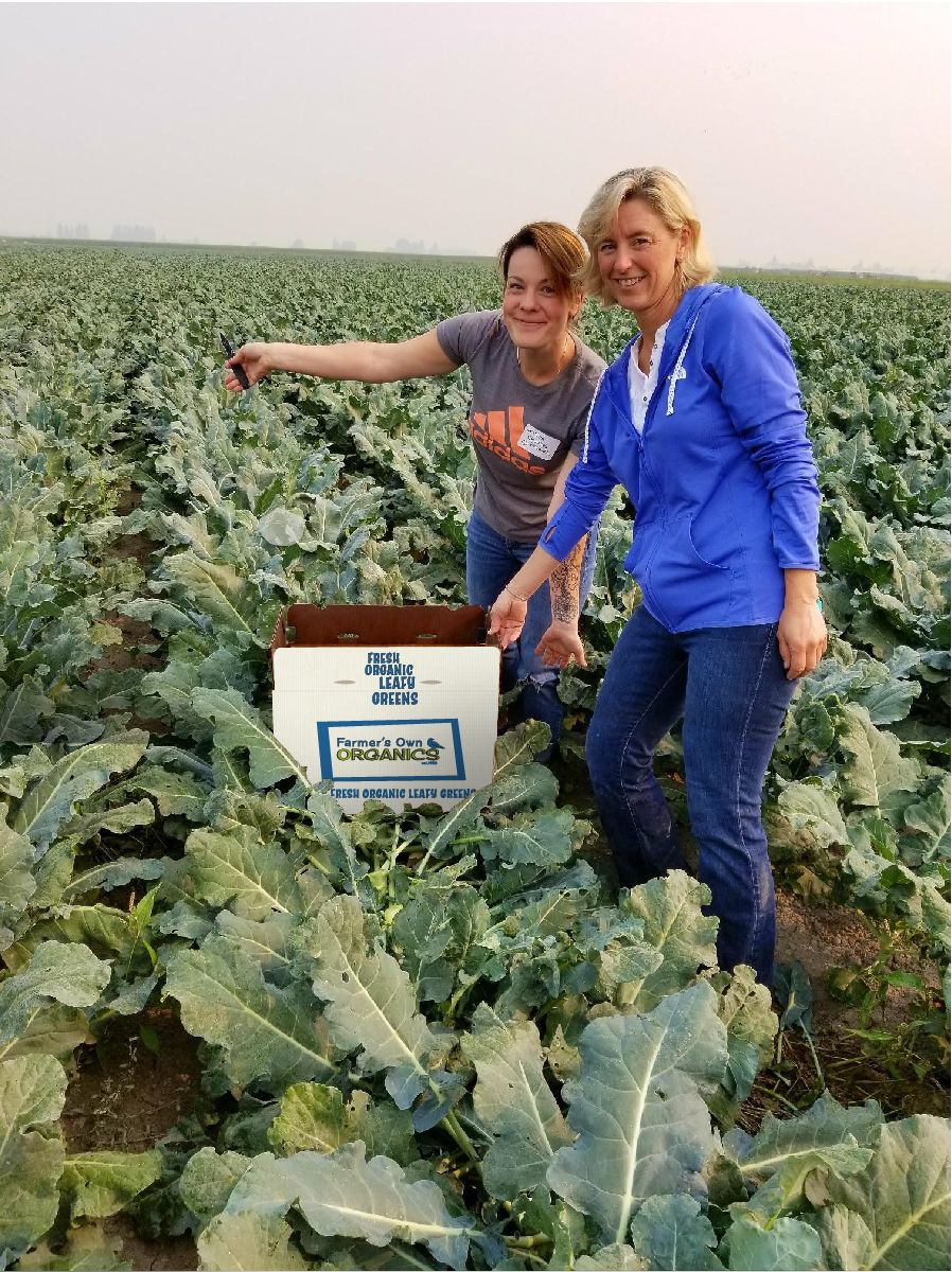
Charlie's Organics
ButtonFor this project, the challenge was in rebranding an established product to attract new audiences.
-
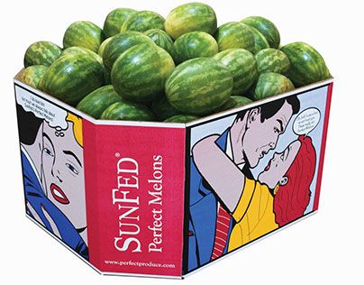
![]()
SunFed Watermelon Bins
ButtonThe 2017 watermelon bin borrows spring and summer colors from Retro Lilly Pulitzer collections.
(View Project)


-
![]()
Really Swell
(View Project)The client had a great product but was unsure of how to take it to market. We developed ten unique, eye-catching jar labels and three combo bags that can work together or alone.
-
![]()
Almost Famous
(View Project)SunFed's growers had perfectly good mishappen fruit left over after each pass in the field.
-
![]()
Yumi Watermelon
(View Project)Yumi, which means Beautiful in Japanese and Yummy in English, was the perfect name, and it was easy from there.
-
![]()
Better Life Organics
(View Project)When our Client acquired Better Life Organics, it desperately needed a brand upgrade. We researched the field and presented what you see here.
-
![]()
Nippy Surf
(View Project)This one's personal. Inhouse project to develop a cold water (because not everyone lives in Hawaii) surf brand.
-
![]()
Cara Cara
(View Project)The challenge was distinguishing SunTreat's Cara Cara from other growers and calling it out to retailers and consumers. For the design, we decided to stress the pink aspect of the fruit.
-
![]()
Bueno Bueno
(View Project)For this project, the challenge was in rebranding an established product to attract new audiences, while ensuring that current users feel connected. The results were outstanding.
-
![]()
Soho Sweets
(View Project)Our hand-drawn tomato label for SunFed. In a crowded market, we needed to stand out. SoHo Sweets are incredibly flavorful and, of course, sweet.
-
![]()
SunFed Perfect Produce
ButtonFor this project, the challenge was in rebranding an established product to attract new audiences, while ensuring that current users feel connected. The results were outstanding.
-
![]()
Daisy Girl Organics
(View Project)Organic Brands in Produce were all earth tone and rather bland. We wanted something big and bright for Daisy Girl, and we went with simple graphics and bold colors.
-
![]()
SunFed Melonhead
(View Project)New product for SunFed Produce. A two count of Mini Watermelons. Worked up these two characters in a hotel in Austin.
-
![]()
Yum Melon
(View Project)A stand out melon needs a stand out label. Continuing in the tradition of giving our products bold, bright looks Yum Melon borrows from fashion illustrations to call attention to a great tasting melon that might otherwise be overlooked.
-
![]()
Mr & Ms Eggplant
(View Project)We needed a leave behind and or a introduction piece for our current and potential customers. I created these as a limited run of 30..
-
![]()
Cycling Gear
ButtonFor this project, the challenge was in rebranding an established product to attract new audiences, while ensuring that current users feel connected. The results were outstanding.
-
![]()
Charlie's Organics
ButtonFor this project, the challenge was in rebranding an established product to attract new audiences, while ensuring that current users feel connected. The results were outstanding.
-
![]()
SunFed Watermelon Bins
ButtonThe 2017 watermelon bin borrows spring and summer colors from Retro Lilly Pulitzer collections.
(View Project)